HeyTrade adds candlestick and volume charts

Information is power. Find out why candlestick and volume charts are so popular with the international trading community.
Starting today, HeyTrade features two new chart types that allow you to make more informed trading decisions. Use the new Japanese candlestick and volume charts and learn about a stock’s price evolution and the interest it arouses among the investment community.
How to read a candlestick chart
The Japanese developed this type of chart in the 18th century. It has gained popularity in the investment world due to its ability to visually show the price of a stock over a given period.
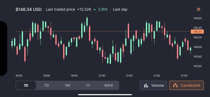
A candlestick chart consists of a series of individual candles representing a specific time interval, such as a day, week, or hour. Each candlestick has a rectangular body and two lines protruding from it, called shadows or wicks.
The body of the candlestick represents the range between the opening price and the closing price of the period in question. If the closing price is higher than the opening price, the body of the candlestick will be represented in green, and we will say that the candlestick is bullish. On the other hand, if the closing price is lower than the opening price, the body of the candlestick will be red, and we will say that the candlestick is bearish.
The shadows of the candlestick represent the range between the highest price and the lowest price reached during the selected period.
It is important to note that candlestick analysis is only one tool within the technical analysis and is best used in combination with other indicators.
What is a volume chart used for?
You can also display a volume chart in the company details tab. Volume reflects the number of shares that are bought and sold in a given period of time.
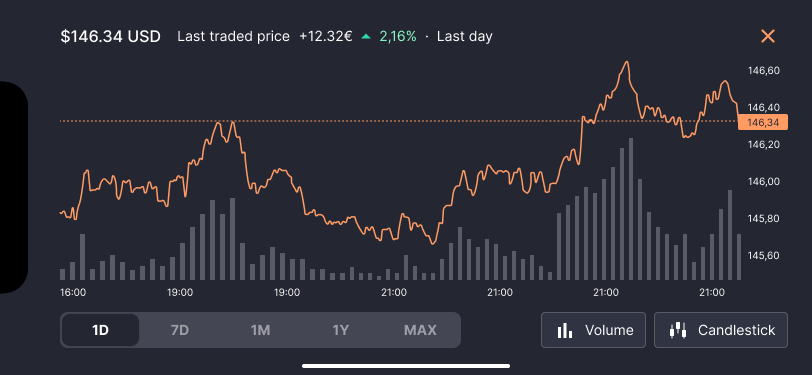
This value is represented by gray vertical bars. Generally, high volume indicates high interest and conviction in the price movement, while low volume may indicate a lack of interest or less participation.
Volume can be useful in confirming price patterns and identifying support and resistance levels. For example, if we observe a significant increase in volume along with an upward price movement, this can be a sign of strength and confirm an uptrend. On the other hand, if we see an increase in volume along with a fall in prices, this may indicate increased selling pressure and confirm a downtrend.
How to display the new charts?
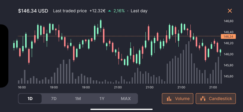
To view the candlestick and volume charts, simply select the “Candlestick” or “Volume” buttons on the company details tab. Remember that you can select both buttons at the same time to compare and get more information on trends and the volatility of the stock.
The new charts are available on both the mobile app and the web version of HeyTrade.
If you have any questions, please send us an email at support@heytrade.com. We will be happy to help you.